




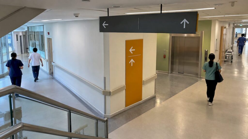
Hospital wayfinding design is settled at the planning stage, not at the signage stage. In Singapore, a system that works combines the building’s layout, a clear sign hierarchy, accessibility under the Code on Accessibility 2025, and coordination with interior finishes and lighting. It also has to pass the relevant authority submissions. Owners, developers and design teams who treat wayfinding as a late-stage graphics package usually pay for it in redesign and resubmission.
TL;DR
- Effective wayfinding starts with the building plan: the more a hospital is designed with navigation in mind, the less signage it needs, according to NSW Health’s wayfinding guide.
- Use a sign hierarchy (identity, directional, informational, advisory, confirmation) and place signs at decision points, as set out in LTA’s Guide for Wayfinding Signage.
- The Code on Accessibility 2025 applies to new areas and to alteration works that need plan approval, and Chapter 8 governs signage and wayfinding.
- Large hospitals may trigger a Walking and Cycling Plan with wayfinding to public transport under URA’s requirements.
- Colors and landmarks support the system but must never carry it alone.
Table of Contents
- Why hospital wayfinding is a design discipline
- Core principles of effective hospital wayfinding
- Planning routes, zones and decision points
- Legibility and accessibility for every user
- Coordinating wayfinding with interior design
- Singapore standards that apply
- Authority checks when wayfinding is part of a project
- Our perspective
- Taking the project to submission
- FAQ
- Sources
Why hospital wayfinding is a design discipline
Patients and visitors arrive anxious, often unwell, and frequently for the first time. They may be elderly, carrying a child, or reading none of the four official languages fluently. The Ministry of Health notes that hospital signage has become a specialty as hospitals grow into complex multi-department buildings, and that a hospital planning team normally includes a signage consultant, which is the approach MOH uses for its public hospitals.
The consequence for project teams is practical. Wayfinding decisions touch the architecture (where lifts and entrances sit), the interior design (finishes, lighting, landmarks), the engineering (ceiling services that compete with sign positions) and the approvals (accessibility, fire and land transport requirements). Settling them in isolation produces conflicts that surface during authority review or, worse, after handover.
The Healthcare Facility Design Standards (HFDS) show the direction of travel. At the launch on 9 December 2025, Minister for Health Ong Ye Kung said the standards standardize architecture, interior design, medical planning and M&E systems, including ward layouts, wayfinding designs, plumbing systems and lifts. Wayfinding is therefore treated as a defined part of the hospital design package and not as decoration. Teams working on public healthcare projects should confirm with the appointing agency which HFDS elements apply.
Core principles of effective hospital wayfinding
NSW Health’s guide, an international reference for healthcare facilities, defines effective wayfinding as helping a person know where they are, where they are going, which route is best, and when they have arrived. It names four elements that must work together: processes, environment, communication and tools. It also observes that hidden lifts and winding corridors hinder a person’s mental map, while purpose-designed spaces and memorable landmarks help.
From this, five working principles follow:
- Legible layout first. Simple circulation, visible lift cores and a clear main entrance reduce the number of decisions a visitor makes. Signs should confirm the plan, not compensate for it.
- Information in the right order. NSW Health advises delivering information at the right time without overwhelming users. A sign that lists twelve destinations at a lobby fails that test.
- Consistency. The same terminology, pictograms and sign positions throughout the building and on the website, letters and appointment messages.
- Priority destinations. Emergency and the main entrance need prominence. Victoria’s emergency department guidelines direct patients to the triage desk, the first point of interaction, using white text on a solid emergency-red background.
- Testing with real users. HCCA’s design advice of August 2025 recommends user-testing wayfinding and signage with people of varied literacy and disability backgrounds.
The journey also begins before the front door. Visitors who plan their route, including medical visitor transport in Singapore, arrive at drop-off points and entrances that the signage system must pick up without a break. Designing the arrival zone, drop-off canopy and first sign together avoids a gap at the point where confusion is highest.
Planning routes, zones and decision points
A sign hierarchy that matches the journey
LTA’s Guide for Wayfinding Signage classifies signs into five types, known as IDIAC. The table below shows how each translates to a hospital.
| Sign type | Purpose | Hospital example |
|---|---|---|
| Identity | Names a place | Building or block name, department entrance |
| Directional | Points the way | Arrows at lift lobbies and corridor junctions |
| Informational | Gives facts | Floor directory, site map, visiting hours |
| Advisory | Warns or instructs | Restricted-area and infection-control notices |
| Confirmation | Reassures on route | Repeat sign along a long corridor |
Where signs go
LTA’s placement principles are written for pedestrian environments, yet they translate directly to hospital circulation. Signs sit within the pedestrian line of sight, at key decision-making areas such as junctions and atria where people pause, and along established pedestrian flows. They also appear at consistent, predictable locations and along long passages for reassurance. An exclusion zone around each sign protects it from visual clutter, and clustering is avoided.
A practical test is to walk each patient journey, for example from the main entrance to a phlebotomy room, and mark every point where a person could reasonably choose the wrong way. Each such point needs a sign or an unmistakable landmark. Each stretch with no decision point for a long distance needs a confirmation sign.

Zoning and naming
A proposed strategy for University Hospitals Bristol, published in 2013, divides the main hospital into five lettered zones, with departments numbered sequentially under each zone letter. It also limits what is visible at each level of the hierarchy, so a person sees only the information relevant to their zone, while the Emergency Department and Main Entrance are signposted from outside their zones. The principle is transferable to Singapore campuses with multiple blocks, podiums and link bridges: name zones once, number departments logically and elevate only the destinations everyone needs.
HCCA also advises flexible solutions such as decals instead of fixed floor lines, because ward layouts and building use change over time. For renovation and A&A projects in operating hospitals, this keeps later reconfiguration from requiring a full signage rebuild.
Legibility and accessibility for every user
MOH states that effective hospital signage needs three things: enough signs, signs that are prominent and clearly understood, and signs that serve patients and visitors of different language abilities. MOH relies on pictorial signage as far as possible and uses all four official languages where practical, because four-language signs can become cluttered and ineffective. For designers, the lesson is to lead with pictograms and short, plain wording, and to reserve multilingual text for the places where it adds clarity.
The Code on Accessibility 2025 sets the baseline. Points that matter for hospital signage include:
- Tactile and Braille signs at accessible facilities, with wall signs mounted at a comfortable reading height of 900 to 1500 mm from the floor for people with visual impairment (clause 1.3.5.2).
- Symbol of Access directional signs at non-accessible entrances, pointing to the accessible alternative.
- A permanent floor diagram of accessible routes on every storey of non-residential buildings.
- Chapter 8 (Signage and Wayfinding), which also covers the International Symbol of Access, signs identifying accessible facilities, general signage and service or information counters.
BCA’s consultation on the draft Code, opened on 30 December 2024, proposed that directional signs to accessible facilities comprise the Symbol of Access together with an indication of the facilities. Drawings prepared to the 2019 version should be checked against the current text.
Beyond the Code, BCA publishes a Companion Guide and Universal Design guides with non-mandatory recommendations to exceed the baseline, built on seven principles including simple and intuitive use and perceptible information. Hospitals serve a high share of elderly users, so these recommendations are worth adopting where budget allows. Our guides on universal design principles for buildings in Singapore and the accessibility code checklist for Qualified Persons set out the design and submission points in more detail.
Two further practices come from the consumer-focused guidance. HCCA suggests showing distance and time on signs and digital maps, for example an imaging department at 50 m and a three-minute walk. NSW Health recommends that digital tools coordinate with physical signage so the transition from website to on-site directions is seamless. Both reduce the dependence on staff for directions.
Coordinating wayfinding with interior design
Interior finishes are the second layer of wayfinding. They help people recognize where they are before they read a sign.
Landmarks. NSW Health advises that landmarks be clearly recognizable, easy to describe, not too similar to one another and large enough to stand out. Public art, such as sculpture, paintings or digital projections, can serve this role at atria and lift lobbies.

Color. Color zones are popular in hospital design, but NSW Health is specific that color should complement rather than anchor the system. Roughly 10% of men are color blind, usable colors must be easy to describe, some clash with interior palettes, and color has no logical sequence. Any color code therefore needs a non-color back-up such as letters, numbers or pictograms. Early collaboration between the wayfinding designer and the interior designer ensures that added color draws the eye and sits well with the overall palette.
Lighting and contrast. The Code and the International Health Facility Guidelines point to strong contrast, with a brightness differential of 70% or more, reduced glare and large legible lettering for people with limited vision. HCCA also recommends lighting all entrances, signage and drop-off areas. This is where signage meets the electrical design: luminaire layouts, ceiling services and sign positions have to be coordinated on one reflected ceiling plan. Our note on lighting design standards and approvals covers the regulatory side.
Materials. Matte sign faces avoid glare. Floor finish changes at department entrances can act as thresholds, but they must meet slip-resistance and level-change requirements, which the Qualified Person checks against the Code.
Singapore standards that apply
| Document | Relevance to hospital wayfinding |
|---|---|
| Code on Accessibility 2025 | Mandatory for new areas and for alteration works requiring plan approval; Chapter 8 covers signage |
| LTA Guide for Wayfinding Signage | IDIAC types, placement principles, design write-up; encourages compliance with SS 599 |
| SS 599:2014 | Generic pedestrian wayfinding principles with attention to elderly users; excludes safety, fire and evacuation signs, signs for persons with disabilities, and road and carpark signs |
| HFDS (MOH) | Standardized wayfinding designs for public healthcare projects |
| URA Walking and Cycling Plan | Wayfinding to public transport for large hospitals |
The exclusions in SS 599 matter. Fire and evacuation signs and accessibility signs follow their own regimes, so a hospital’s signage package spans several documents and several authorities. Treat the general wayfinding system, the accessibility signs and the fire safety signs as three layers to be reconciled on the same drawings.
Authority checks when wayfinding is part of a project
For building plan submissions, BCA requires a Qualified Person, either a registered Architect or a Professional Engineer with a valid practising certificate, to submit plans, obtain prior written URA permission and ensure compliance with the Code on Accessibility. From 1 October 2025, new projects with a gross floor area of 30,000 sqm or more submit through CORENET X, and others through CORENET 2.0. A hospital of any real scale will usually fall in the first group.
A practical checklist:
- Confirm whether the Code applies. It covers new areas and existing areas undergoing addition and alteration works that need approval from the Commissioner of Building Control. Where full compliance is constrained in an existing building, owners and designers must make every effort to reach the outcomes to the fullest extent possible.
- Test the URA trigger. URA requires a Walking and Cycling Plan for hospitals of 40,000 sqm GFA or more, or 320 beds or more, whichever is reached first. The plan must include wayfinding signage to public transport facilities and amenities for cyclists, plus barrier-free routes.
- Prepare the LTA write-up. LTA asks developers to provide a short statement of the wayfinding principles adopted and to design the system in tandem with the development from the concept stage.
- Align fire safety. Exit and evacuation signage falls under SCDF’s regime and sits outside SS 599.
- Coordinate with healthcare licensing. Healthcare projects have additional requirements beyond building plan approval, so the timetable should allow for them.
Our articles on how to submit BCA plans without delays, the URA submission timeline and SCDF and FSSD submissions explain each stage. For the wayfinding principles specifically, see our spec-ready wayfinding design principles.
Our perspective
Wayfinding fails most often at the interface between disciplines. The architect positions a lift core, the interior designer selects a feature wall, the M&E engineer routes ducts across a corridor ceiling, and the sign lands wherever space remains. Each decision is defensible alone, and together they leave a junction with no clear sign position.
Our position is that wayfinding belongs in the design brief from concept stage, alongside accessibility and the authority strategy. A Professional Engineer leads our firm, with decades of experience in Singapore infrastructure, and our team of engineers and architects works across architectural, interior design, civil, structural and M&E disciplines, so these interfaces can be resolved on one set of drawings.
The submission route is part of the same discussion. BCA, URA, SCDF, LTA and the other statutory boards each look at a different aspect of the project, and we handle submissions to all of them. Preparing the accessibility drawings, the Walking and Cycling Plan content and the fire safety information together reduces the rounds of comment that follow from inconsistent drawings.
Aman
Taking the project to submission
Stellar Structures provides architectural and interior design, civil, structural, geotechnical and M&E engineering, and authority submissions to BCA, URA, HDB, JTC, SCDF, PUB, LTA, NEA and NParks for projects in Singapore. For a hospital or healthcare facility, that means wayfinding, accessibility and approvals can be planned within one engagement, from concept layout through to the submissions each authority requires.
Project teams can review the full range of services on our services page and brief us on the project’s scale, whether new build or addition and alteration, and the authorities involved.
FAQ
What is the difference between wayfinding and signage in a hospital?
Signage is one tool within wayfinding. NSW Health describes wayfinding as the combined effect of communication, design, architecture and environment, and notes that a building designed with navigation in mind needs fewer signs. Layout, landmarks, lighting and digital information all contribute alongside the signs themselves.
Do Singapore hospitals have to use all four official languages on signs?
Not on every sign. MOH relies on pictorial signage as far as possible and uses all four official languages where practical, because four-language signs can become cluttered and less effective. Designers should lead with clear pictograms and add languages where they help comprehension.
At what height should Braille and tactile wall signs be mounted?
The Code on Accessibility 2025 sets the comfortable reading height for tactile and Braille wall signs at 900 to 1500 mm from floor level for a person with visual impairment. The Code also requires a permanent floor diagram of accessible routes on every storey of non-residential buildings.
Is color coding enough to guide patients to departments?
No. NSW Health advises that color should complement the wayfinding system and not carry it, since roughly 10% of men are color blind and color has no logical sequence. Pair every color zone with letters, numbers or pictograms, and use it to support the interior design palette.
Which authorities should be consulted on hospital wayfinding?
BCA for the Code on Accessibility and building plan approval, URA where the Walking and Cycling Plan is triggered, LTA for its wayfinding guide, and SCDF for fire and evacuation signage. Public healthcare projects should also confirm HFDS requirements with the appointing agency.
Sources
- Hospital Signages, Ministry of Health
- Wayfinding, NSW Health
- Wayfinding and signage guidelines for emergency departments, Victoria Health
- Guide for Wayfinding Signage, Land Transport Authority
- Wayfinding for University Hospitals Bristol NHS Foundation Trust
- Northside Hospital design advice, HCCA, August 2025
- Code on Accessibility 2025, BCA
- Universal Design Guides, BCA
- Building Plan submission, BCA
- Walking and Cycling Plan, URA
- Speech by Minister for Health at the Healthcare Facility Design Standards launch, MOH
- SS 599:2014 Guide for wayfinding signage in public areas, Singapore Standards
- BCA proposes to enhance Code on Accessibility, Rajah & Tann
Recommended
- Spec Ready Wayfinding Design Principles for Designers, Accessibility First
- Universal Design Principles for Buildings in Singapore
- Interdisciplinary Design Best Practices in Singapore